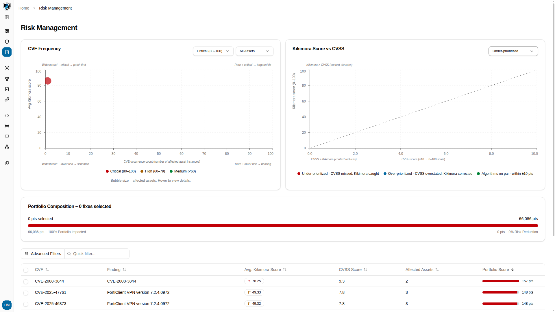

CVE Frequency matrix
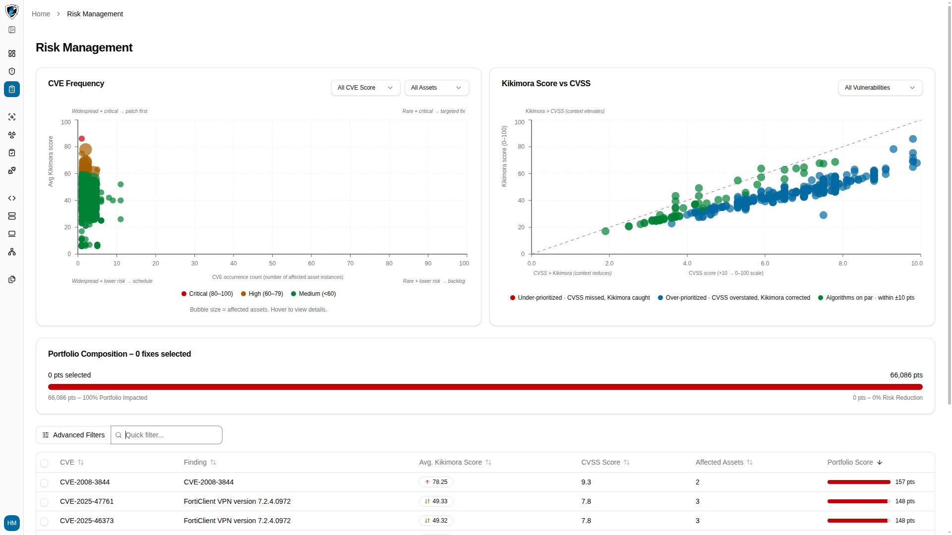
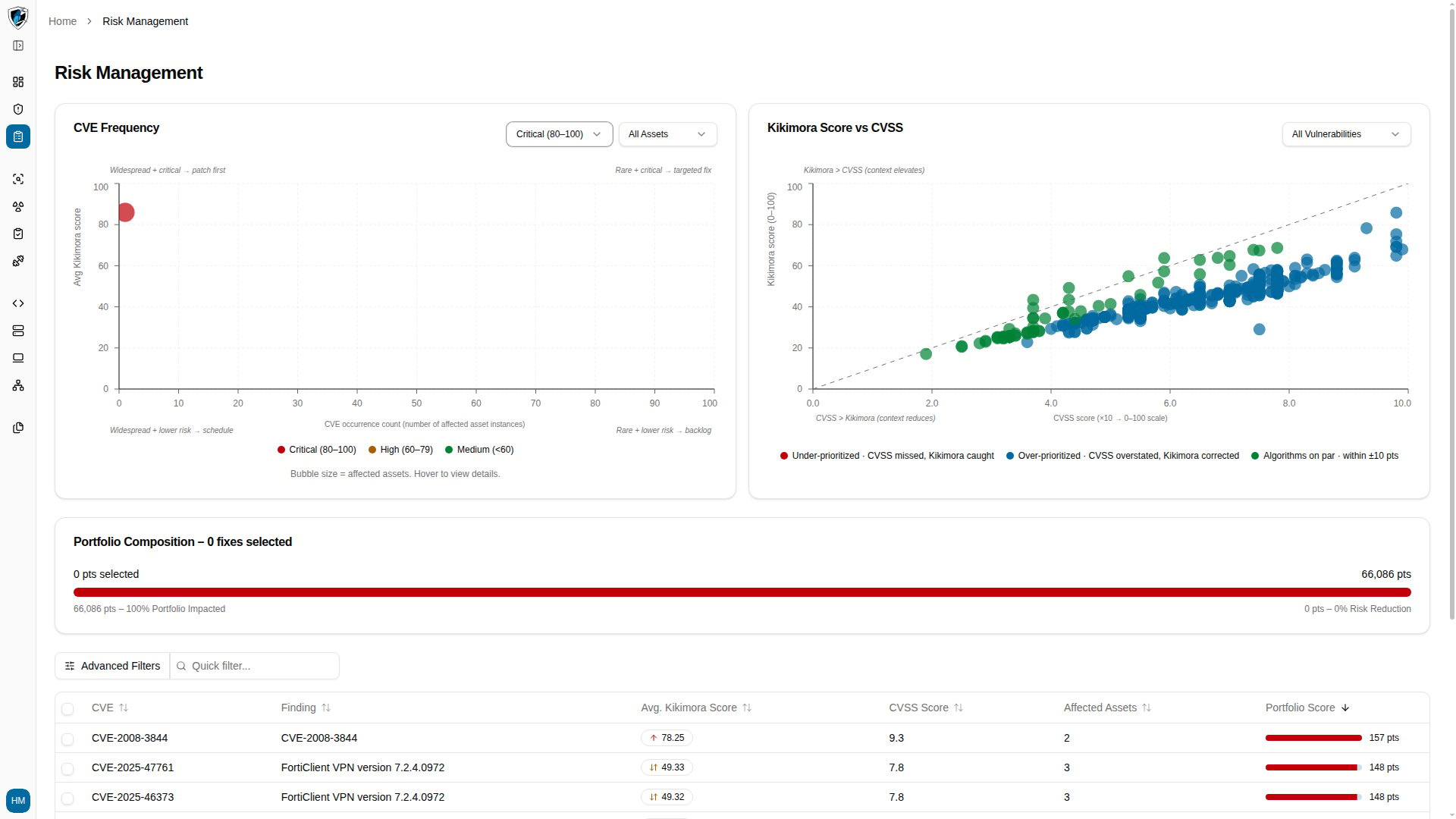
The matrix plots findings by CVE score severity against how often they occur across asset instances. Bubble size represents the total number of affected assets. The four quadrants tell you what to do with each group:
You can filter the matrix by score band: Critical (80–100), High (60–79), or Medium (below 60).
Kikimora Score vs CVSS
This scatter plot compares static CVSS severity against contextual Kikimora Scores to expose findings that generic scoring got wrong. Three categories:- Under-prioritized — CVSS missed or understated the risk, but the Kikimora Score caught high environmental impact.
- Over-prioritized — a high CVSS score corrected downward because the asset has low exposure or existing mitigations.
- Algorithms on par — the Kikimora Score and the normalized CVSS score agree within ±10 points.
Portfolio composition and risk reduction
This widget shows aggregate portfolio risk points, the impact of the fixes you have selected, and the total risk reduction percentage those fixes would achieve.Work through the charts
-
Review the chart overview to see CVE Frequency and Kikimora Score vs CVSS side by side.
-
Filter the CVE Frequency matrix to a score band, such as Critical (80–100), to narrow the plot to your highest-severity findings.
-
Filter the scatter plot to Under-prioritized to isolate findings where contextual risk exceeds the standard CVSS score.